Practice Set: Correlations
Correlations
Correlations enable us to describe the relationship between two variables. We can answer many different questions that we have in psychology by looking at correlations. Which of these questions could be answered simply by looking at a correlation? Why or why not?
- Does social media use cause depression?
- Do people care less about the environment when they make more money?
- Are middle aged people happier than young and old people?
- Is drinking coffee associated with having more friends?
- Am I happier when I need fewer attempts to solve the wordle for the day?
Warning
- Correlation \(\neq\) causation
- Correlations look at linear relationships
Let’s start with some assumptions that we have to look into before we can happily correlate any variables we come across.
These are variables from a dataset that is embedded within the car package. Can you spot problems with either of these variables?
df <- carData::Ginzberg

ggplot(df, aes(x = depression)) +
  geom_histogram(binwidth = .2, fill = "blue") +
  theme_classic()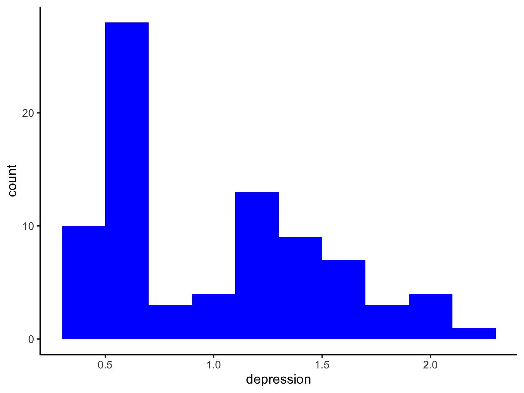
ggplot(df, aes(x = fatalism)) +
  geom_histogram(binwidth = .2, fill = "black") +
  theme_classic()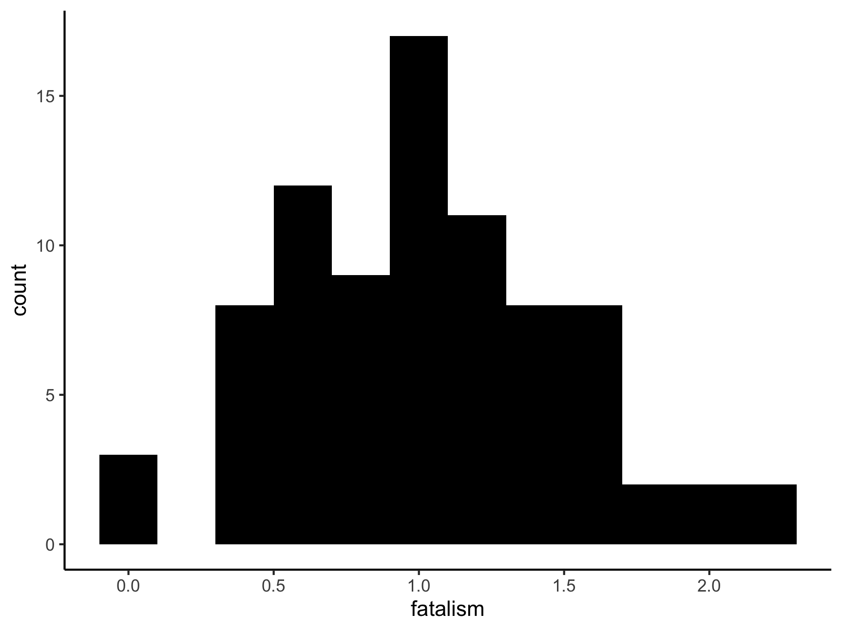
ggplot(df, aes(x = fatalism, y = depression)) +
  geom_point() +
  ggtitle("Corelation between fatalism and depression") +
  geom_smooth(method = lm, se = FALSE)
## `geom_smooth()` using formula 'y ~ x'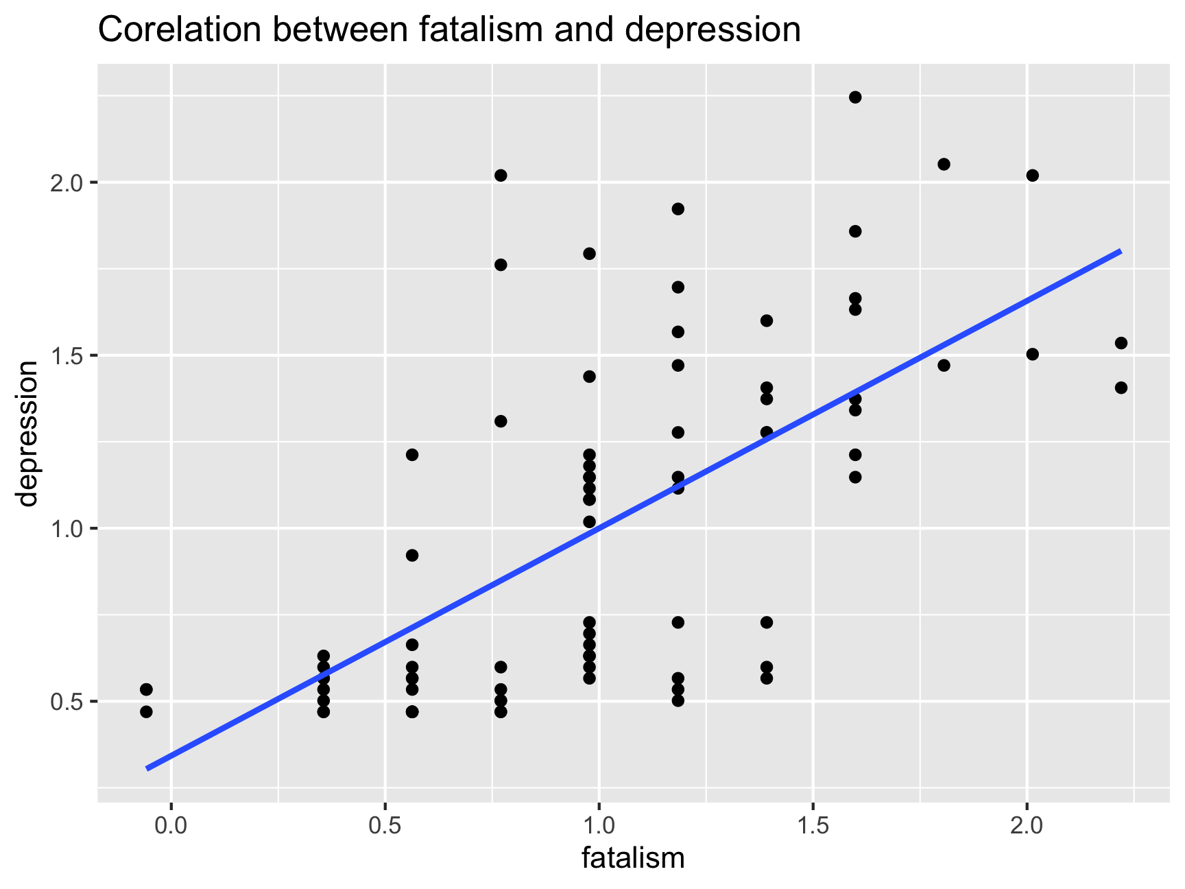
Let’s have a look at how depression is correlated with simplicity (i.e.,subject’s need to see the world in black and white). What do you notice about the simplicity scale?
ggplot(df, aes(x = simplicity)) +
  geom_histogram(binwidth = .2, fill = "black") +
  theme_classic()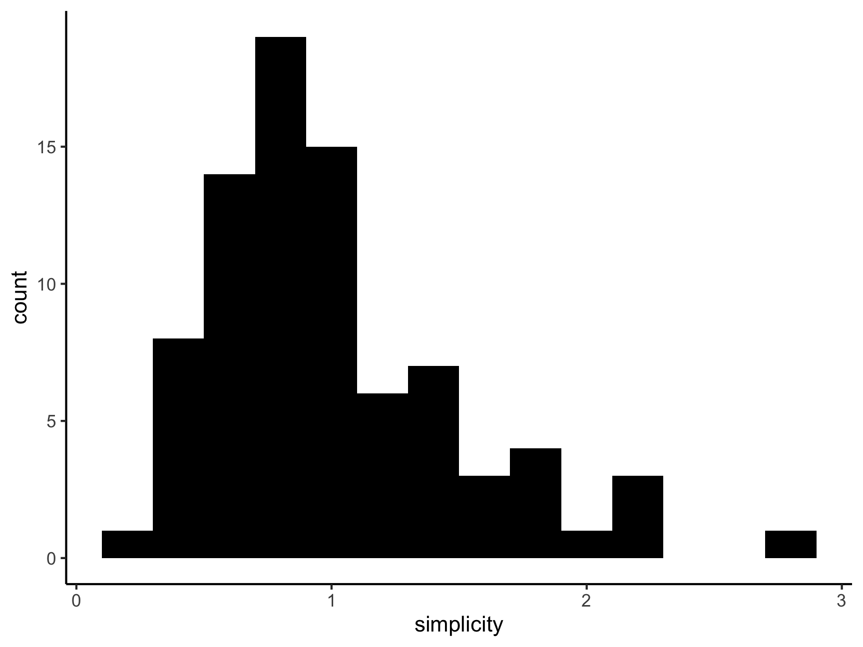
ggplot(df, aes(x = simplicity, y = depression)) +
  geom_point() +
  ggtitle("Correlation between simplicity and depression") +
  geom_smooth(method = lm, se = FALSE)
## `geom_smooth()` using formula 'y ~ x'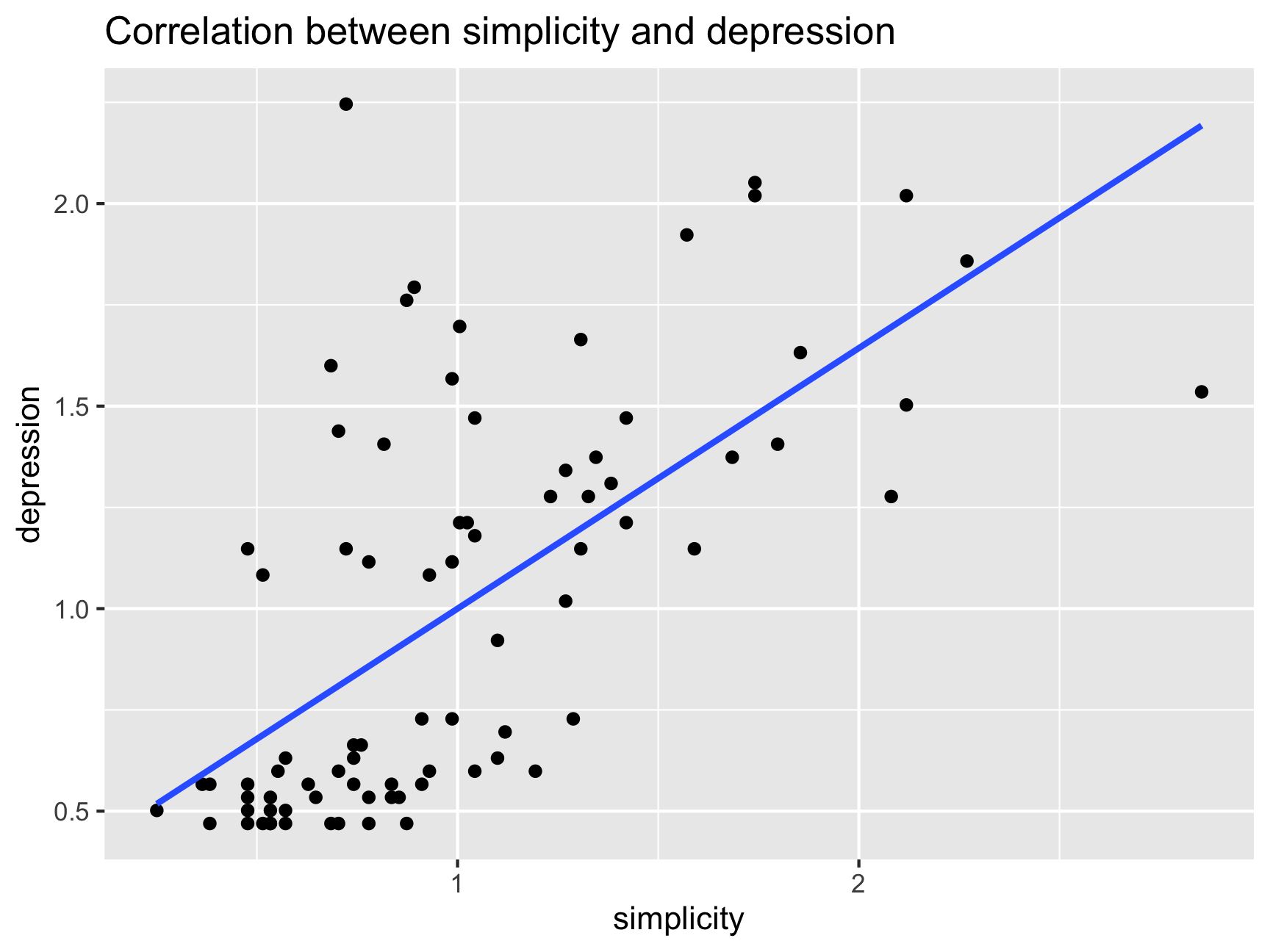
cor(df$simplicity, df$depression)## [1] 0.6432668df %>%
filter(., !simplicity > 2.85) %>%
summarise(out = cor(simplicity, depression,
use = "complete.obs"))## out
## 1 0.6570763And finally, an example of something that I come across all the time in my research – couples that participate in research studies together are waaay too happy….
relsat <- rnorm(75, mean = 6, sd = 0.2)
pos_emo <- rnorm(75, mean = 3.5, sd = 1)
df <- cbind.data.frame(relsat, pos_emo)

ggplot(df, aes(x = pos_emo)) +
  geom_histogram(binwidth = .2, fill = "salmon") +
  xlim(0, 7) +
  theme_classic()
## Warning: Removed 2 rows containing missing values (geom_bar).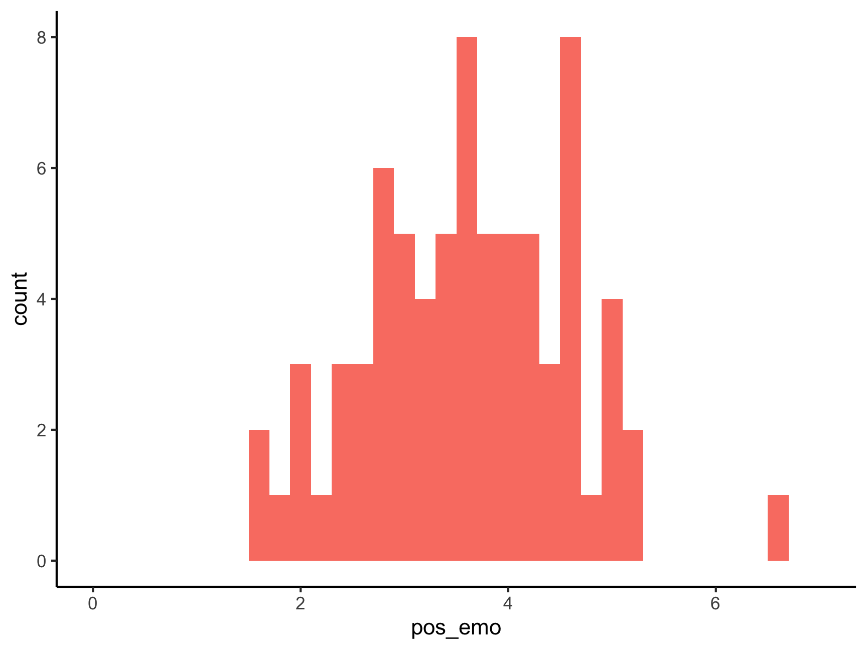
ggplot(df, aes(x = relsat, y = pos_emo)) +
  geom_point() +
  ggtitle("Correlation between positive emotions and relationship satisfaction") +
  geom_smooth(method = lm, se = FALSE) +
  xlim(0, 7)
## `geom_smooth()` using formula 'y ~ x'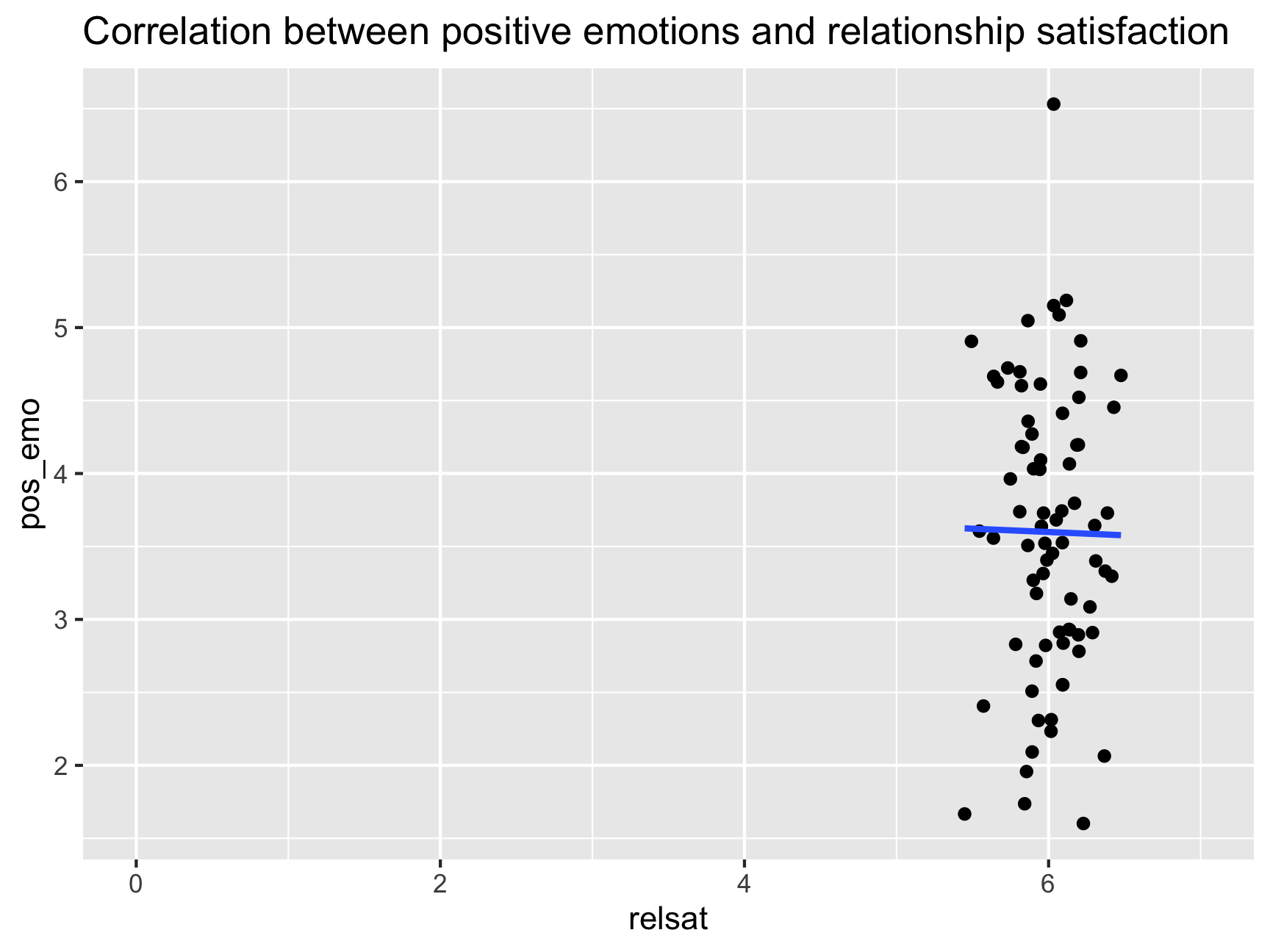
IMPORTANT: When you get a certain correlation value you should always look at a scatterplot because things might not be as they seem…
Someone wrote a really fun R-Package to show this - cannonball. We can enter different correlation coefficients (r) and sample sizes (N) and see examples of what the data underlying those correlation looks like
# library(devtools)
# install_github("janhove/cannonball")

plot_r(r = 0.3, n = 100, showdata = FALSE, plot = TRUE)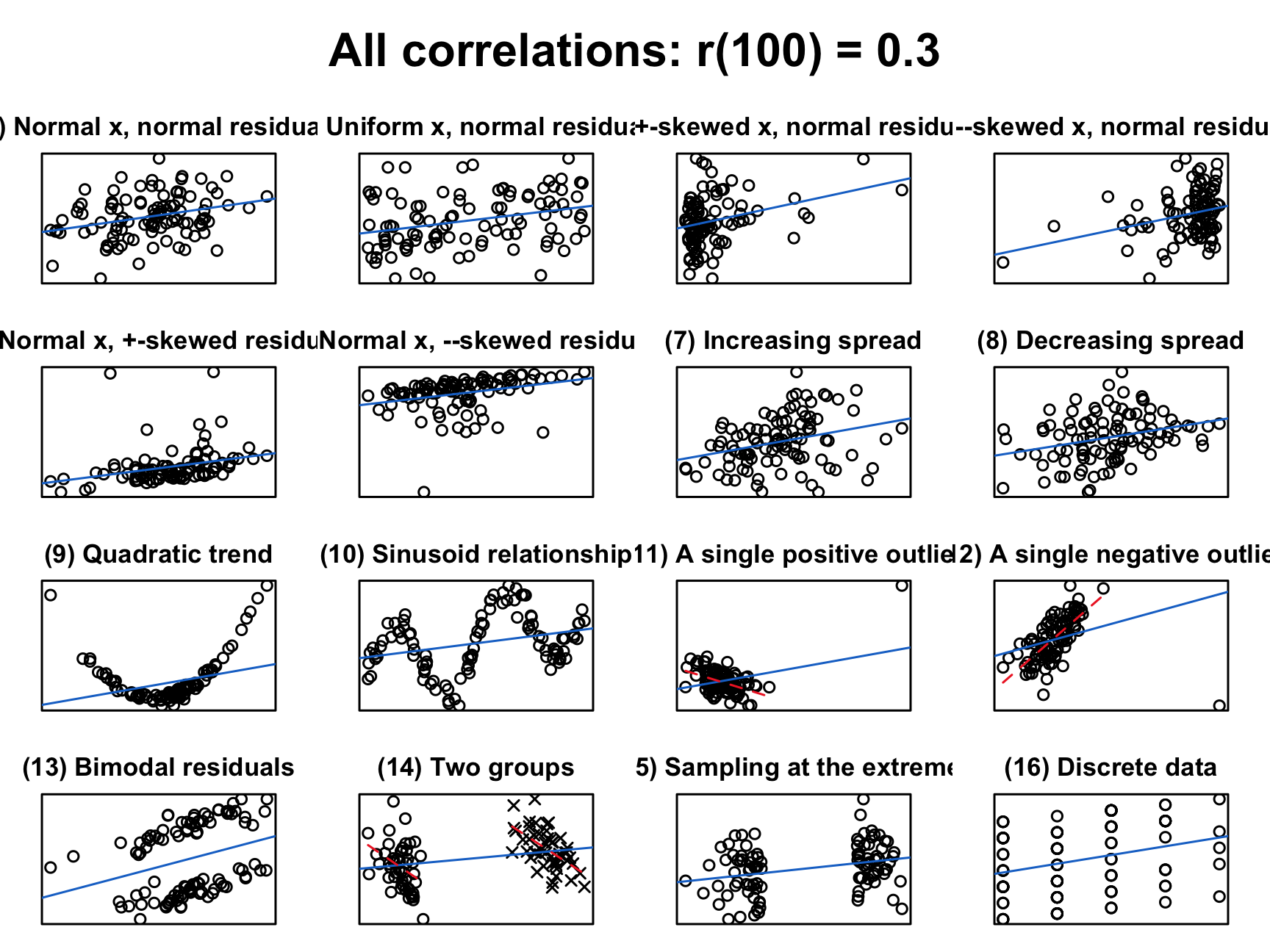
Now let’s get some practice getting correlations!
cor(df$fatalism, df$depression)## [1] NAWhy is our result NA? What could be going on here?
How to get rid of NA? How would you tell R to “not use observations from people that have any missing values”?
# this is the default and does not work
cor(df$fatalism, df$depression, use = "everything")
## [1] NA# this one works
cor(df$fatalism, df$depression, use = "complete")## [1] 0.6509671How do we handle missing values if we are looking at several correlations in the dataset?
cor(select(df, c("simplicity", "fatalism", "depression")))## simplicity fatalism depression
## simplicity 1 NA NA
## fatalism NA 1 NA
## depression NA NA 1cor(select(df, c("simplicity", "fatalism", "depression")), use = "complete")## simplicity fatalism depression
## simplicity 1.0000000 0.6316438 0.6454335
## fatalism 0.6316438 1.0000000 0.6402812
## depression 0.6454335 0.6402812 1.0000000cor(select(df, c("simplicity", "fatalism", "depression")), use = "pairwise")## simplicity fatalism depression
## simplicity 1.0000000 0.6294402 0.6454600
## fatalism 0.6294402 1.0000000 0.6509671
## depression 0.6454600 0.6509671 1.0000000Quick Quiz
Now that we have gotten correlation coefficients, how do we know whether the correlations are significant? A simple way to do that is to use corr.test from the psych package
corr.test(select(df,
                 c("simplicity", "fatalism", "depression")),
          use = "pairwise")
## Call:corr.test(x = select(df, c("simplicity", "fatalism", "depression")),
## use = "pairwise")
## Correlation matrix
## simplicity fatalism depression
## simplicity 1.00 0.63 0.65
## fatalism 0.63 1.00 0.65
## depression 0.65 0.65 1.00
## Sample Size
## simplicity fatalism depression
## simplicity 78 76 75
## fatalism 76 78 76
## depression 75 76 78
## Probability values (Entries above the diagonal are adjusted for multiple tests.)
## simplicity fatalism depression
## simplicity 0 0 0
## fatalism 0 0 0
## depression 0 0 0
##
## To see confidence intervals of the correlations, print with the short=FALSE optionWhich correlations are significant here?
Why are the sample sizes different?
Right now we are only dealing with three different correlations at a time but once you add more and more variables to your correlation matrix it can get hard to keep an overview of what’s going on - corrplot can be a useful way of getting an overview of your correlations
cors <- cor(select(df,
                   c("simplicity", "fatalism", "depression")),
            use = "complete")

corrplot(cors, diag = FALSE)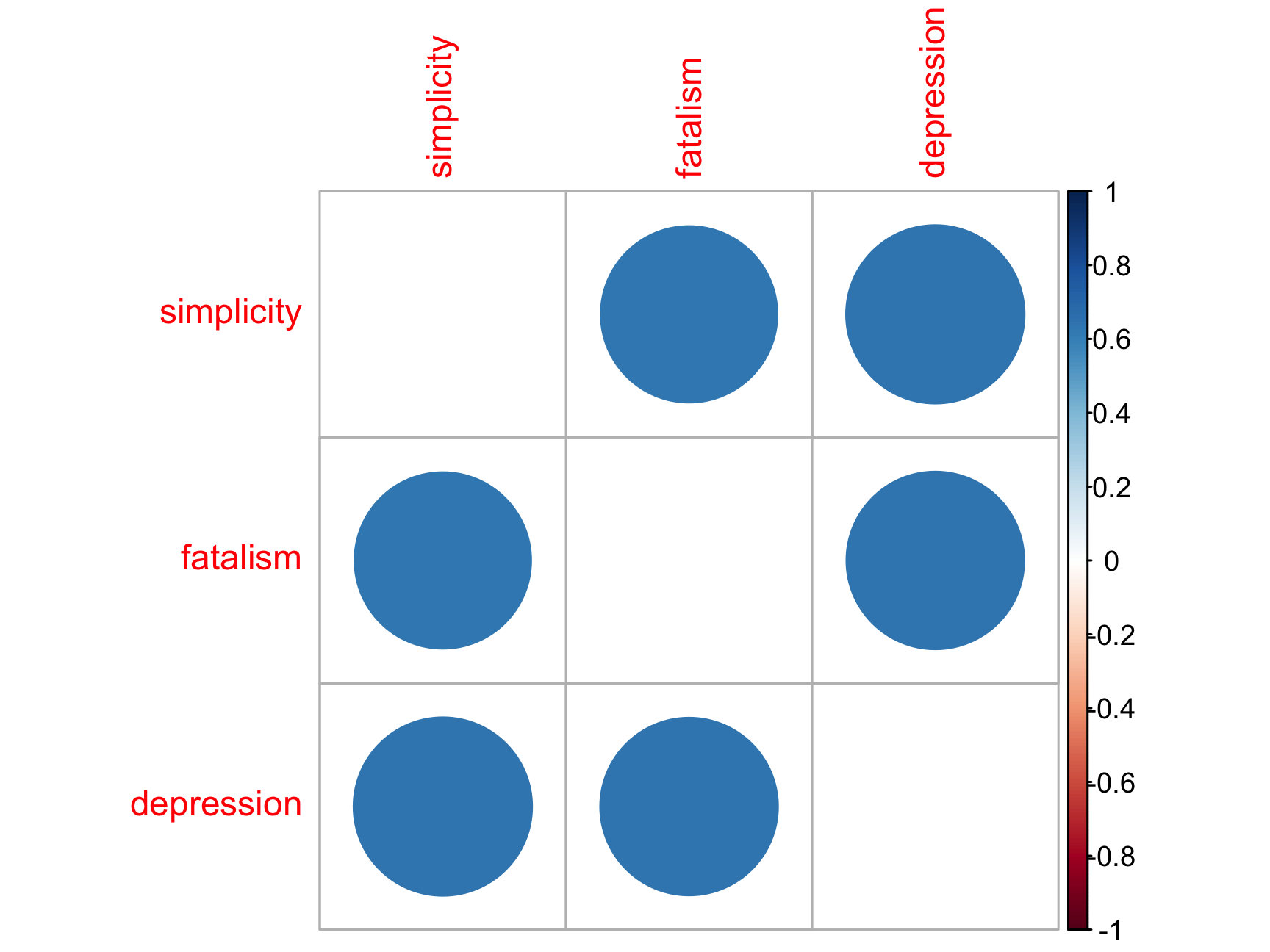
You try!
The first line of the code below adds a grouping variable (Group 1 vs. Group 2).
- Get the correlations between
fatalismanddepressionfor group 1 and for group 2 Name thisCOR1 - Do the same thing for
depressionandsimplicityfor group 1 and group 2 Name thisCOR2
Hint: do you remember tidyverse?
Massive shout out to the Sping 2022 AI Tabea Springstein for creating this excellent Practice Set!