Practice Set: Statistics & Plotting
Note: It will be really helpful for you to have the 9: Stats & Plot slides pulled up in a different tab while you complete this practice set. You’ll likely need to refer to it.
Setup: We will be using the same midus.csv dataset for this practice. You have 2 choices…
- If you want to practice on this website in the code chunks below, please do the following:
- Load the package
ggplot2 - (You do not need to import the dataset – I have done that for you so that you can access it through this website)
- Make sure the variables
sex,heart_self, andheart_fatherare treated asfactor()variables. - Use the same
na.omit()function from the 8: R&R slides to remove allNAvariables. - Look at the first 6 rows of the
midusdata.frame by using thehead()function.
- If you want to practice locally (actually opening up
RStudioon your computer), please do the following: - Either create a new script or open an existing script. Your choice. - Import the data file. You should already have this downloaded, but just in case, here it is again. Make sure the code you use to import the file winds up in your script!-
midus.csv- Load the package
ggplot2 - Make sure the variables
sex,heart_self, andheart_fatherare treated asfactor()variables. - Use the same
na.omit()function from the 8: R&R slides to remove allNAvariables. - Look at the first 6 rows of the
midusdata.frame by using thehead()function.
- Load the package
-
Plotting with ggplot2
You can make plots with base R (we’ve done this once already!). But they’re kinda ugly. Actually, they’re really ugly. So we’re going to use a package called ggplot2 to make prety plots. This practice set will go through the very basics of how to use ggplot2. For more control over your plots, check out the Data Viz section.
gg stands for the “grammar of graphics”. It’s syntax (or code format) is the same as what we’ve already been doing using functions and objects. However, like the lovable ogre Shrek, ggplot2 has layers. Each layer corresponds to one aspect of the plot.
The basic layout of ggplot2 is:
ggplot(things that impact the entire plot) +
  geom_something(things that impact just the something)
☝️ Here we have:
- 2 different FUNCTIONS:
ggplotis the function for the first layer.geom_somethingis the function for the second layer, where thesomethingis replaced with a plot type. For example,geom_pointis a scatter plot andgeom_histogramis a histogram.
- Each of these functions takes ARGUMENTS:
- The arguments control what you want the plot to look like.
- Many arguments are actually aesthetics and wrapped within
aes().- If your argument depends on the data, it’s wrapped in an
aes() - If your argument does not depend on the data, it does not need to be in an
aes()
- If your argument depends on the data, it’s wrapped in an
- In the first layer (within
ggplot), this will contain things that impact the whole plot. Like your x- and y- axes and what data you’re actually plotting. - In the second layer (within
geom_something), this will contain things that impact only that layer. If you have a histogram, how wide should the bins be? What color should the bars be? Etc.
- Each layer is separated by a
+sign. This tells R “hey wait, I’m not done yet”.- It should ALWAYS go at the very end of each line…never at the beginning of a new line.
- You do not need one on the very last line of your plot code (here, there’s not one after
geom_something) because after the last line, you’re ready for R to run your code.
Example on aesthetics/arguments from the slides
## here() starts at /Users/coop/Psych4175No arguments or aesthetics into geom_point layer (the default):
ggplot(data =  midus, aes(x = age, y = BMI)) +
  geom_point()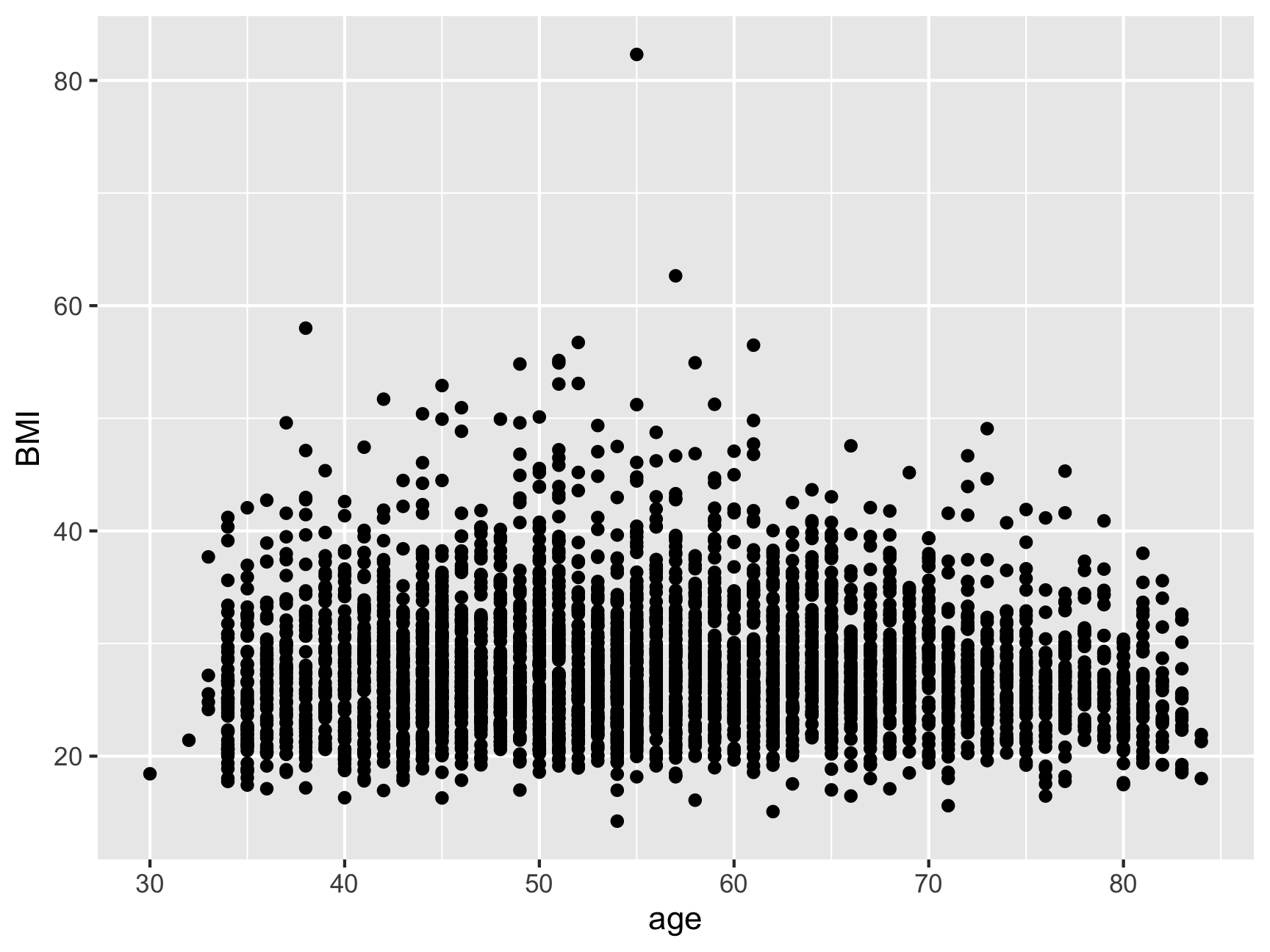
Argument in geom_point layer. But it is NOT dependent on the data. “Make all the points corn flower blue”. Note that the color is within quotes.
ggplot(data =  midus, aes(x = age, y = BMI)) +
  geom_point(color = "cornflowerblue")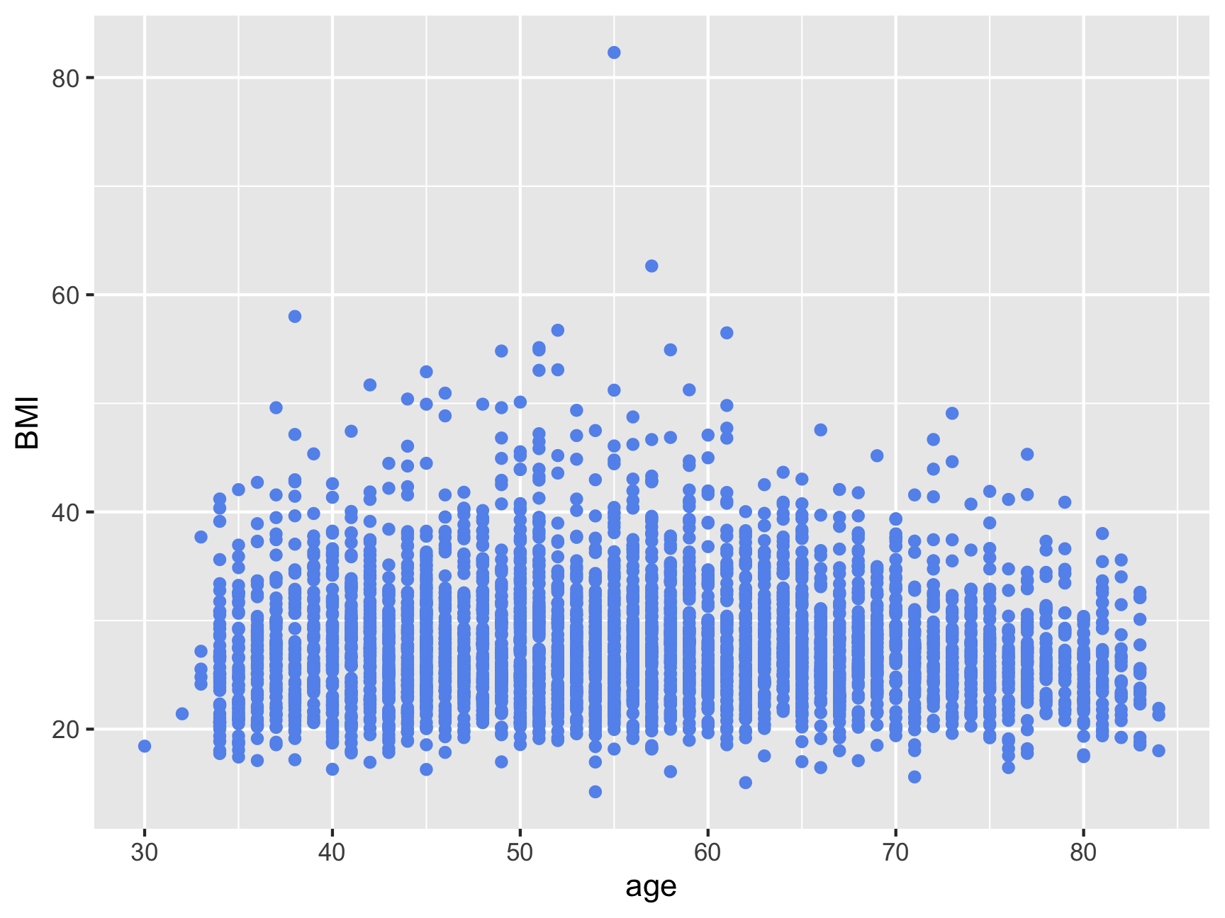
Argument in geom_point layer. But it IS dependent on the data. “Make the points different color based on the sex factor variable”. Since it’s dependent on the data, we wrap it within an aes(). Note that sex is not in quotes.
ggplot(data =  midus, aes(x = age, y = BMI)) +
  geom_point(aes(color = sex))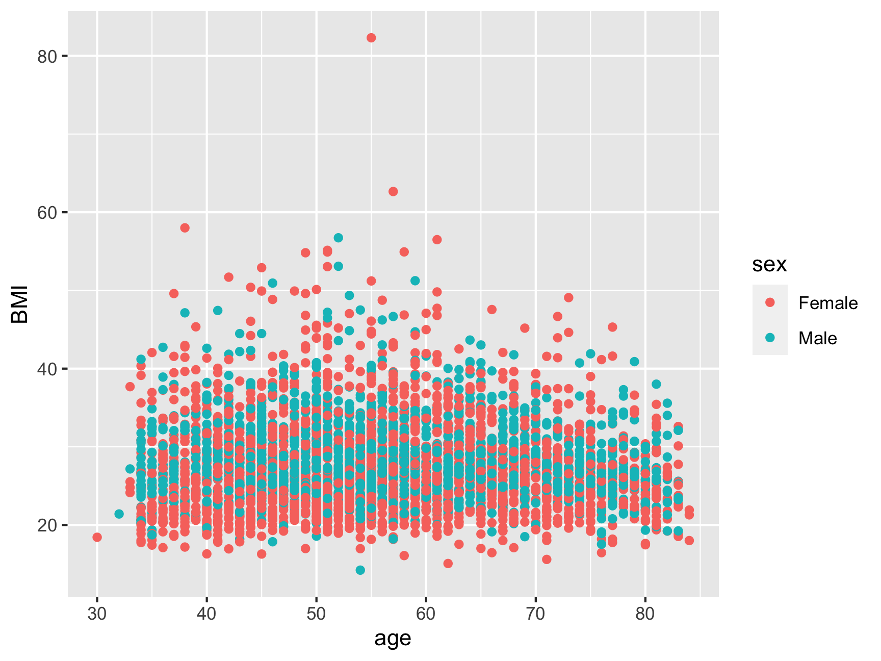
Statistics
The corresponding slides go through a variety of basic statistical tests. They are:
t.test()cor()andcor.test()aovlm
Use the slides as a guide to complete the following exercises using stats and plotting.
\(t\)-test
You try! Is there a difference in life satisfaction between people who have had heart problems compared to people who have not had heart problems?
- Statistic: \(t\)-test
- Plot: Boxplot
Bonus:
- Look at the help page for
t.test(). How do you run a one-tailed \(t\)-test? Run it! Does your answer change? - How could you
fillthe boxplots so that males and females are shown in different colors? - Look at the help page for
labs()and see if you can give your plot a title and different x- & y-axes labels.
Correlation
You try! Does age correlate with BMI?
- Statistic: Correlation
- Plot: Scatter plot
Bonus:
- Set the
sizeof all points to be 1.5 - Change the x- & y-axes labels and add a title and subtitle
- Make the shape of the points different based on if they’ve ever been diagnosed with a heart issue or not
ANOVA
You try! Is there a main effect of age_category, a main effect of heart_self, and is there a age_category x heart_self interaction on BMI?
- Statistic: 3x2 ANOVA
- Plot: Bar plot
Setup for analysis
As of now, we don’t have an age_category variable. The code below trichotomizes age into the following groups:
- 28-40 years old = “young”
- 41-60 years old = “middle”
- 60-84 years old = “old”
Additionally, bar plots can kind of suck. The height of each bar should be the mean of the dependent variable for each group. After the trichotomizing code, I have written several lines of code to help you get all the data you need. Whenever you see an empty set of quotation marks "", you need to fill in the blanks (HINT: read the variable names!).
Finally, at the very bottom of the chunk, we make a data.frame based on everything from the middle chunk. You do NOT need to change this part of the code. But do try to understand what it’s doing!
Now, run the analysis
Now that you’ve done the hard work of making your categorical variable and your data.frame of means for the plot, go ahead and write/run code for the ANOVA and bar plot!
(Again, we will learn how to do this analysis prep in a MUCH easier way when we talk about the tidyverse)
Regression
You try!
- Does self-reported physical health predict self-reported mental health?
- Do self-reported physical health and self-reported heart problems predict self-reported mental health (without an interaction)?
- Same as above but now including a self-reported physical health and self-reported heart problems interaction.
- Statistic: Simple & Multiple Regression
- Plot: Scatter plot
CONGRATULATIONS!
You have now finished The Basics portion of this bootcamp, workshop, class…whatever you want to call this. You’re basically ready to go work at Google & Facebook etc. See you at the next section where we’ll learn how to clean and prep our data.
